Skin is where most beginning painters get stuck. A student can paint a decent apple or a decent landscape, and then a face defeats them. The skin comes out flat, orange, or muddy, and they assume the problem is talent. It almost never is. The problem is the approach.
The usual approach is to look for the right tube color. There is no right tube color. Skin is never one flat color, and no single paint, mixed or straight from the tube, can carry a whole face. What works is a system. In my classes I teach skin the same way every time: three values for every skin type, mixed from a small set of colors. Once students stop hunting for a magic tube and start thinking in three values, their portraits change fast.
This article walks through that system: why one tube color fails, how the three values work, the dip method I teach for mixing in watercolor, and the exact palettes and mixes for light, medium golden, and dark skin.
Why one tube color never works
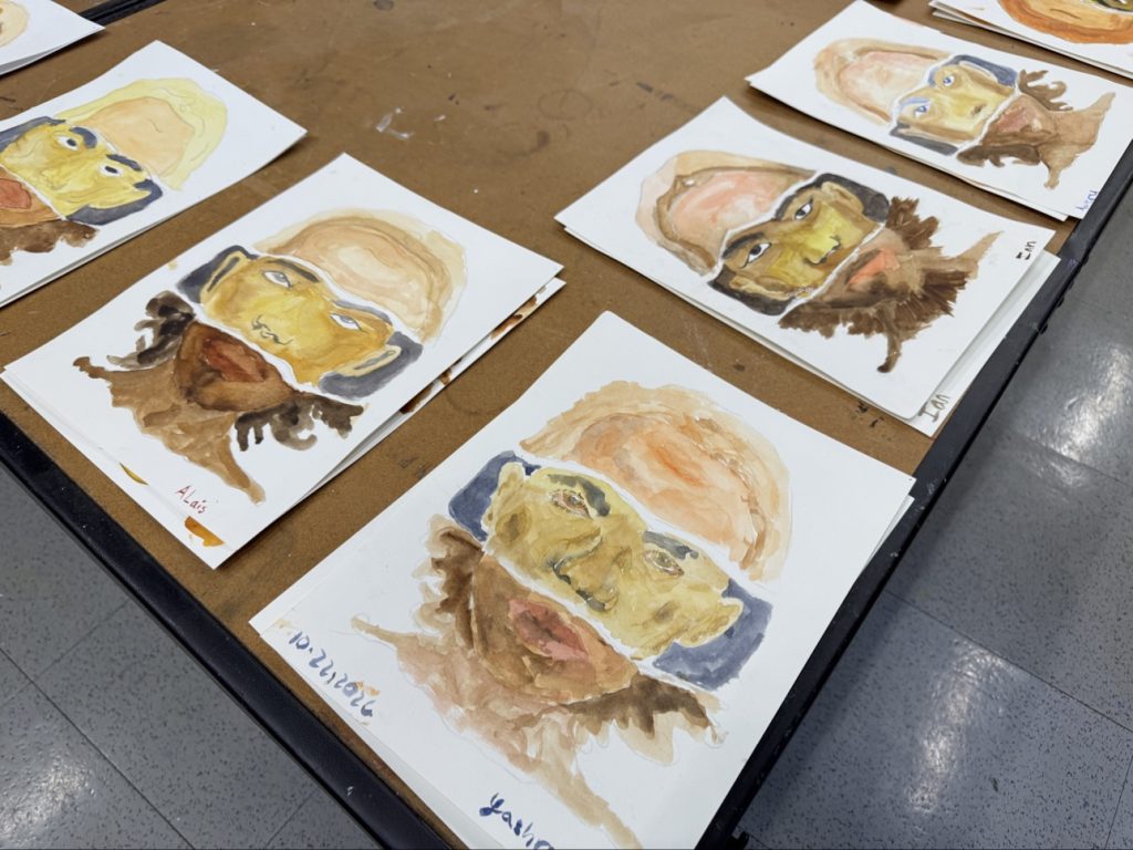
Look at a face in real light. The forehead catches the light and goes pale. The cheeks sit somewhere in the middle. Under the jaw and around the eye sockets, the form turns away and darkens. One face holds a whole range of values, from near white in a highlight to deep shadow, and warm areas sit next to cooler ones as the color shifts.
A single tube color gives you one note. Paint a face with one note and you get a mask, not a head. The drawing underneath can be perfect and the painting still looks wrong, because a face is a rounded form and one flat color cannot describe roundness. Paint sold as a ready-made flesh tint has the same problem. It matches no real person under real light.
There is a second trap. Beginners paint the skin color they carry in their head, a generic peachy tan, instead of the values they actually see. But a portrait reads through its values first. If the light, middle, and dark are in the right relationship, the skin reads as skin, even if the hue is slightly off. If the values are wrong, no correct hue will save it. That is why I teach values before I teach recipes.
The three values: high tone, mid tone, shadow
Every skin type gets the same three values. It does not matter whether the skin is light, medium, or dark: the names stay the same, and only the mixes change:
- High tone: the lightest value, where the light hits the skin most directly.
- Mid tone: the middle value, the skin in soft, even light.
- Shadow: the darkest value, where the form turns away from the light.
Three values are enough. With three, you can build the turn of a cheek, the shadow under a brow, and the light on a forehead. Students sometimes want five or six values right away. I hold them to three. If the three big shapes are wrong, smaller steps between them only decorate the problem.
Mix all three before you paint
I have students mix all three tones before the brush touches the portrait. This matters more than it sounds. When the three puddles sit ready on the palette, you can move from light to shadow in one passage and keep the painting unified. When you mix one tone at a time, each new mix drifts away from the last one, and the face breaks into patches that do not belong together.
Mixing first also forces a useful decision: you have to judge how far apart the three values should be. Light skin has a gentle range, dark skin a stronger one, and deciding that range up front is half the portrait.
See the values, not the color
A practical habit helps here. Squint at your subject. Squinting strips away detail and color and leaves the big value shapes. Under a squint, a face simplifies into light areas, middle areas, and dark areas, which is exactly how you are going to paint it. If you cannot see where the shadow shape sits, you are not ready to paint it yet.
The dip method
In watercolor, I teach mixing by dips. Students need a way to talk about proportions that does not require a scale, and dips give them exactly that.
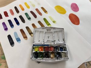
A dip is one touch of your wet brush to the paint pan. Wet the brush, touch the tip to the pan and pull a little color off, then drag it into your mixing puddle. Before you start, pre-wet each pan with a drop of water, so the brush picks up color cleanly.
When I say a mix is 4 dips of one color to 1 dip of another, that is a ratio you can repeat. You can also adjust it on purpose, which is where real learning starts. Add half a dip, watch what changes, and you begin to understand what each color does inside a skin tone.
Water matters as much as pigment in these mixes. The same colors can make a high tone or a mid tone depending on how much water is in the puddle. Lots of water keeps a tone pale and transparent. Little water makes it dense and dark.
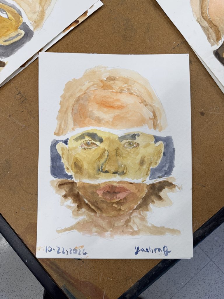
Light skin
Light skin needs a surprisingly small palette. These are the four colors I teach for it:
- Yellow Ochre
- Cadmium Red Pale Hue
- Ultramarine Blue
- Alizarin Crimson Hue
The mixes, tone by tone:
- High tone: 4 dips Yellow Ochre to 1 dip Cadmium Red Pale Hue, with lots of water.
- Mid tone: the same mix, with medium water.
- Shadow: the mid tone plus half a dip of Ultramarine Blue, with little water, and a touch of Alizarin Crimson Hue for the deepest part.
Two things are worth noticing. First, the red is used in small amounts. Light skin goes orange very fast, and beginners almost always add too much red. Second, the shadow does not come from a dark brown or from black. It comes from blue. Half a dip of Ultramarine in the mid tone cools it and darkens it at the same time, which is what real shadow on skin does. The Alizarin Crimson is only a touch, for the deepest accents, inside an ear or under the lower lip.
Medium golden skin
Golden skin sits between the other two, with more warmth in the base. These are its five colors:
- Yellow Ochre
- Cadmium Yellow Hue
- Burnt Sienna
- Burnt Umber
- Ultramarine Blue
The mixes, tone by tone:
- High tone: 3 dips Yellow Ochre plus 1 dip Cadmium Yellow Hue, with lots of water.
- Mid tone: add half a dip of Burnt Sienna, with medium water.
- Shadow: add half a dip of Burnt Umber, with little water, and a deepest touch of Ultramarine Blue.
This palette builds the tone in stages, which makes it a good teaching example. The high tone is a warm yellow base. The Burnt Sienna in the mid tone brings in the red-brown warmth that golden skin carries. The Burnt Umber deepens the shadow, and the final touch of blue keeps the shadow from going dead. Without that touch of Ultramarine, golden skin shadows turn flat and rusty.
Dark skin
Dark skin is built on browns, with blue doing the shadow work again. These are its four colors:
- Burnt Umber
- Burnt Sienna
- Yellow Ochre
- Ultramarine Blue
The mixes, tone by tone:
- High tone: 2 dips Burnt Sienna plus 1 dip Yellow Ochre, with medium water.
- Mid tone: 3 dips Burnt Umber plus 2 dips Burnt Sienna, with medium water.
- Shadow: the mid tone plus half a dip of Ultramarine Blue, with little water.
The most common beginner mistake with dark skin is starting too dark. If your mid tone is already near black, there is nowhere left for the shadow to go, and the high tone has to fight to be seen. Dark skin catches light like any other skin, and the highlight on a forehead or a cheekbone can be surprisingly strong. The Yellow Ochre in the high tone gives that lit area its warmth. The mid tone then steps down through the two browns, and the blue in the shadow adds depth without chalk or ash.
Proportions are a starting point, not a recipe
The dips are a starting point, not a promise. Real mixing is intuitive, and it has to be, because no two puddles are ever identical. The water already in the pan changes what your brush picks up. The water on your brush changes it again. One student’s 4 dips will not match another student’s 4 dips exactly.
So do not chase the recipe. Chase the relationships. What matters is knowing which colors to combine for each skin type, and what each color does when it enters the mix. Yellow Ochre warms and lightens. Ultramarine cools and deepens. Burnt Umber pulls a tone down. Once you understand the small set of colors for the skin in front of you, you can steer a mix by eye, and steering by eye is the actual skill.
A simple routine builds that skill. Mix your three tones. Test each one with a stroke on scrap paper and let it dry before you judge it, because watercolor dries lighter than it looks wet. Compare the three dried strokes. They should read clearly as light, middle, and dark, with clear steps between them. If the shadow looks weak, you know which color fixes it. If the mid tone looks orange, you know which color to hold back. That kind of correction, made calmly before the painting starts, is worth more than any exact formula.
Beginner habits to avoid
Most skin tone problems in class come from a short list of habits. If any of these sound familiar, you are not alone, and every one of them is fixable:
- Reaching for black to make shadow. Black kills skin. In the palettes above, shadows come from blue and from deeper touches of strong color, never from black.
- Painting the whole face one color first and shading it later. Build the face from the three tones from the start, so the light and shadow are part of the structure, not decoration on top.
- Mixing on the painting instead of in puddles. Mixing on the paper gives you no control and no way back. Mix in puddles, test, then paint.
- Using the same amount of water for every tone. Water is a value tool. High tones need lots of it, shadows need little.
- Judging a mix while it is wet. Watercolor dries lighter. A shadow that looks right wet will look weak dry, so mix shadows a touch stronger than you think you need.
- Skipping the high tone on dark skin. Every skin type gets all three values. Leaving out the light flattens the portrait.
None of these habits are about talent. They are process problems, and process can be taught. Skin tones are a learnable system, not a gift.
The skin tones workshop
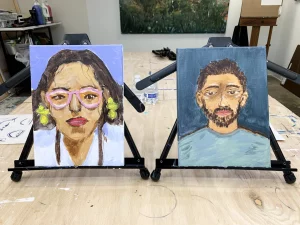
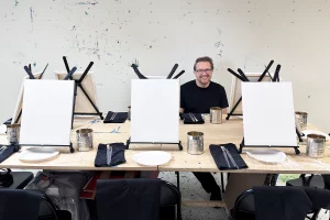
Alongside my regular classes, I teach this system as a dedicated skin tones workshop for universities, colleges, and private groups. It is a hands-on session in acrylics, running two to three hours, built on the same three values.
I bring everything the group needs: paints, brushes, palettes, table easels, aprons, water containers, and canvases or paper. The group can be up to 20 students, and every student completes a portrait study during the session. I have led this workshop at Southern Methodist University and Angelo State University, and at private venues, and it has been received well by students and faculty alike. It is one flat fee with materials included, so a department or a group organizer has nothing to supply beyond the room.
If your department or group would like to host one, reach out through artbeyou.com.
Learn it in class
Portrait and skin tone work comes up regularly in my classes at Art Be You in Richardson. Acrylic classes run on Tuesdays and watercolor classes on Thursdays, both from 6 to 9 PM. The pace of each session follows the group in front of me rather than a fixed plan, and questions about mixing are always welcome.
If skin tones have been your sticking point, come sit in on a class, or look at the workshops on artbeyou.com. Bring your questions and your worst portrait. We will rebuild it three values at a time.