Stop Guessing and Start Building Control Over Your Colors
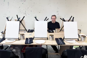
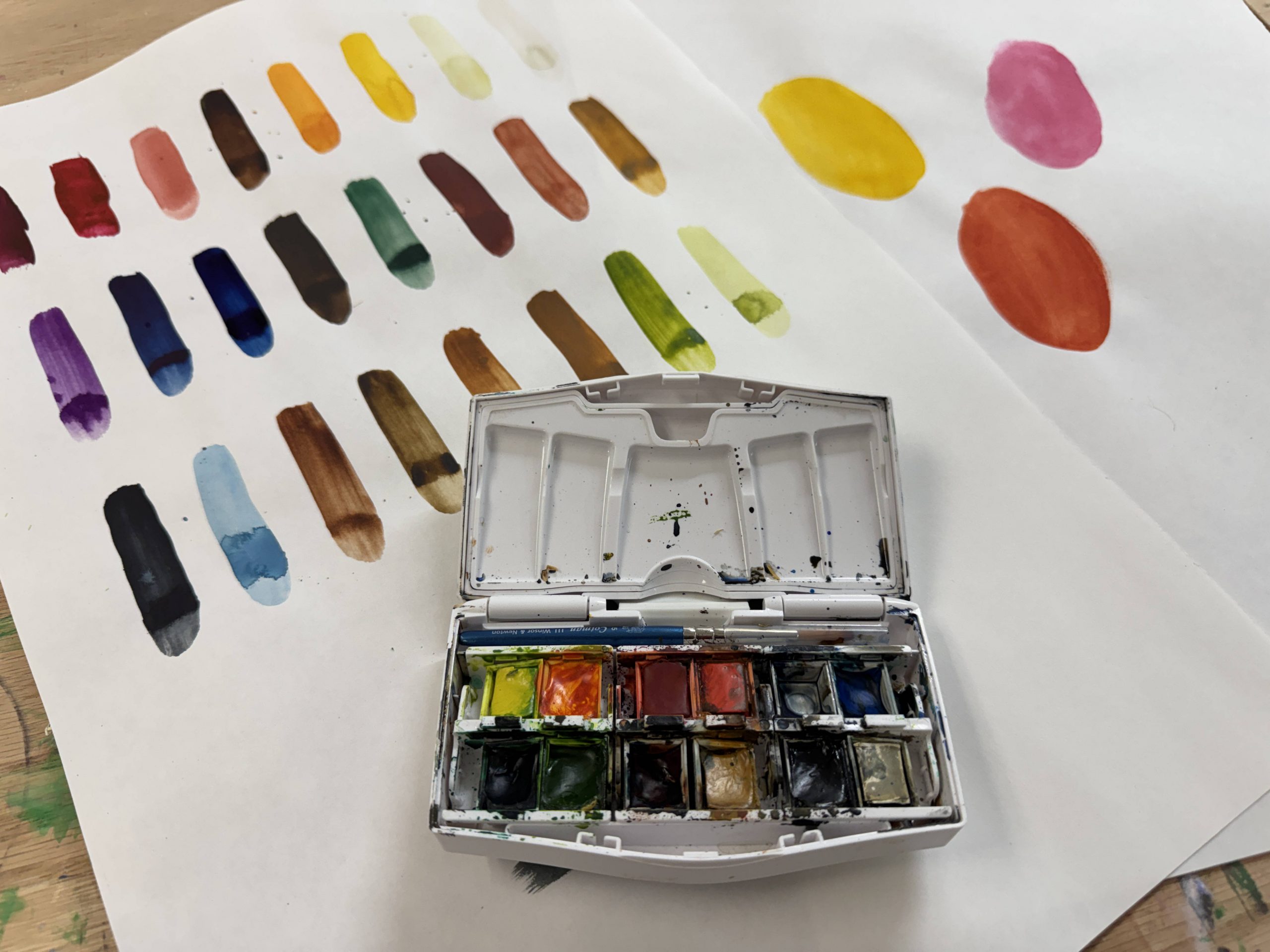
Last Thursday in our watercolor class, we sat down in the studio and faced the blank paper. Instead of overwhelming the group with massive, complex setups, I handed out a specific, assorted palette that I carefully selected for the session.
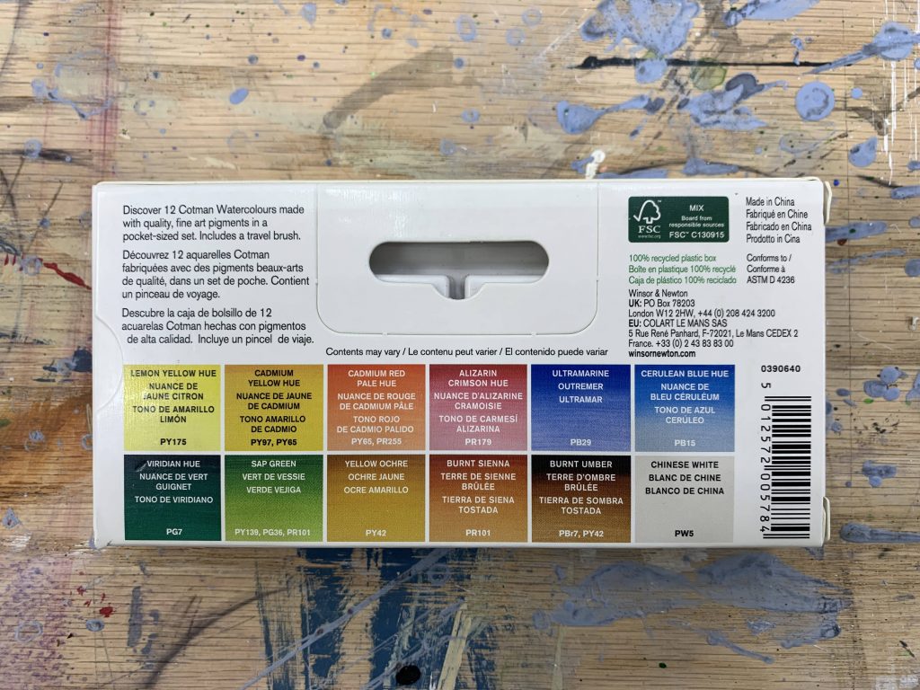
If you are setting up your own space at home, you can find similar compact sets at places like Blick. The set we used is a strict 12-color pan.
Here is the truth about watercolor: you do not need 50 different colors on your palette to make a good painting. In fact, having that many options usually ruins the work. It makes you lazy. You stop looking at the temperature and value of the subject and start relying on pre-mixed tubes. By limiting yourself to just 12 colors, you are forced to explore the pigment. You are forced to mix. You can get every single color you actually need by just using those 12 core pans.
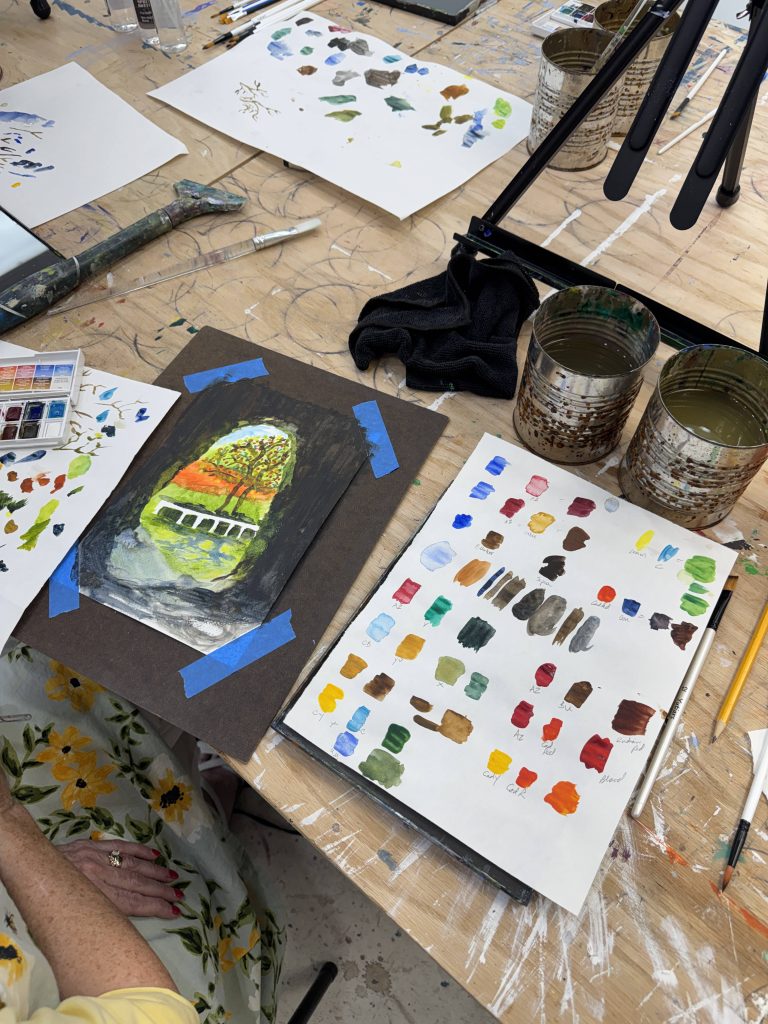
You can see the exact breakdown of the palette we used in this reference.
Don’t forget to join my art classes…..
Acrylic Course on Tuesdays
🗓️ Tuesdays, 6:00 PM – 9:00 PM
👥 Limited strictly to 6 seats per group
🎒 All professional materials included
💵 Tuition: $300
Reserve your spot here: https://artbeyou.com/acrylic-painting-course
Watercolor Course on Thursdays
🗓️ Thursdays, 6:00 PM – 9:00 PM
👥 Limited strictly to 6 seats per group
🎒 All professional materials included
💵 Tuition: $300
Reserve your spot here: https://artbeyou.com/watercolor-painting-course
The 12-Color Studio Palette
To be specific, here are the exact colors we worked with. This is your foundation.
- Lemon Yellow Hue: A cool, sharp yellow that leans slightly toward green.
- Cadmium Yellow Hue: A warm, robust mid-yellow.
- Cadmium Red Pale Hue: A fiery, warm red-orange.
- Alizarin Crimson Hue: A deep, cool red that is essential for dark mixes.
- Ultramarine: A warm, granulating blue that acts as the backbone of your darks.
- Cerulean Blue Hue: A cool, bright blue perfect for skies and vibrant greens.
- Viridian Hue: A cool, stark green that needs to be modified to look natural.
- Sap Green: A warm, earthy green straight out of the pan.
- Yellow Ochre: An opaque, earthy yellow essential for landscapes.
- Burnt Sienna: A warm, rich earth red-brown.
- Burnt Umber: A dark, cool earth brown.
- Chinese White: An opaque white used sparingly to adjust opacity.
The Warm-Up: Relaxing the Hand
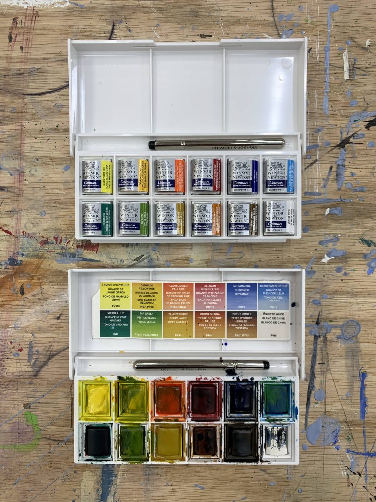
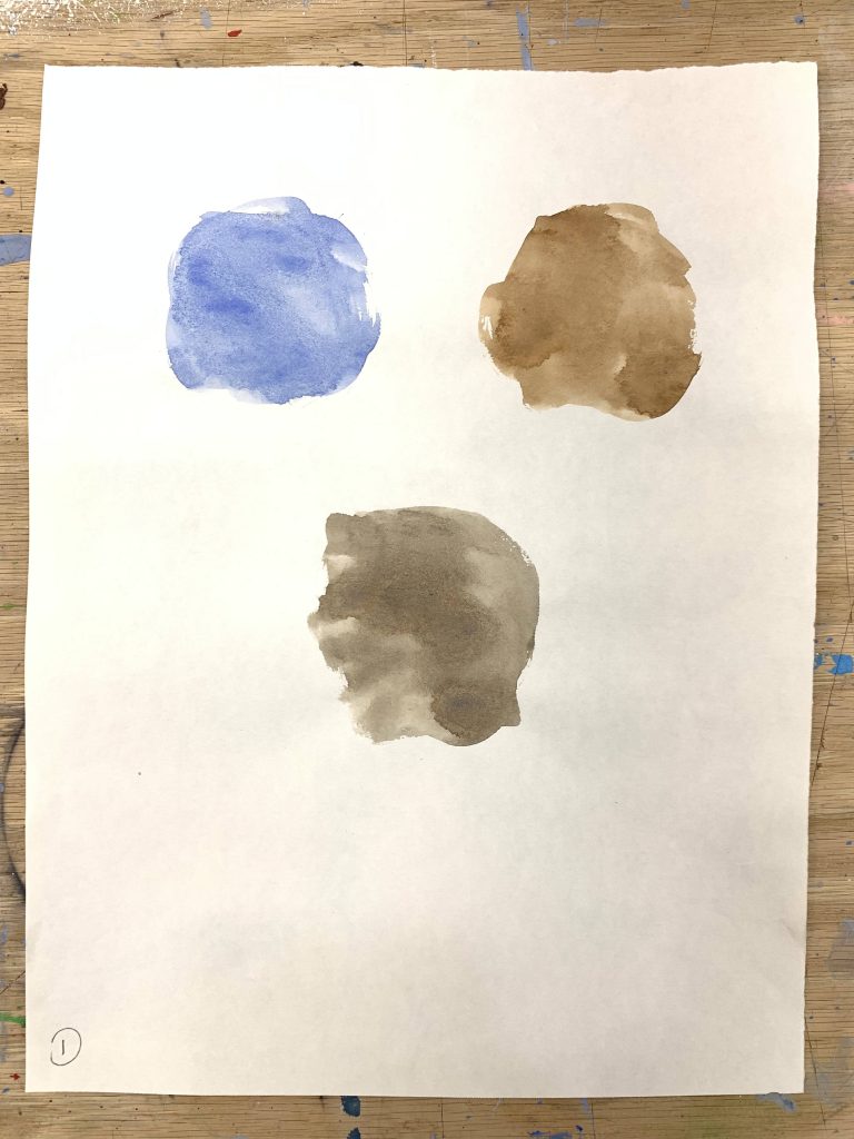
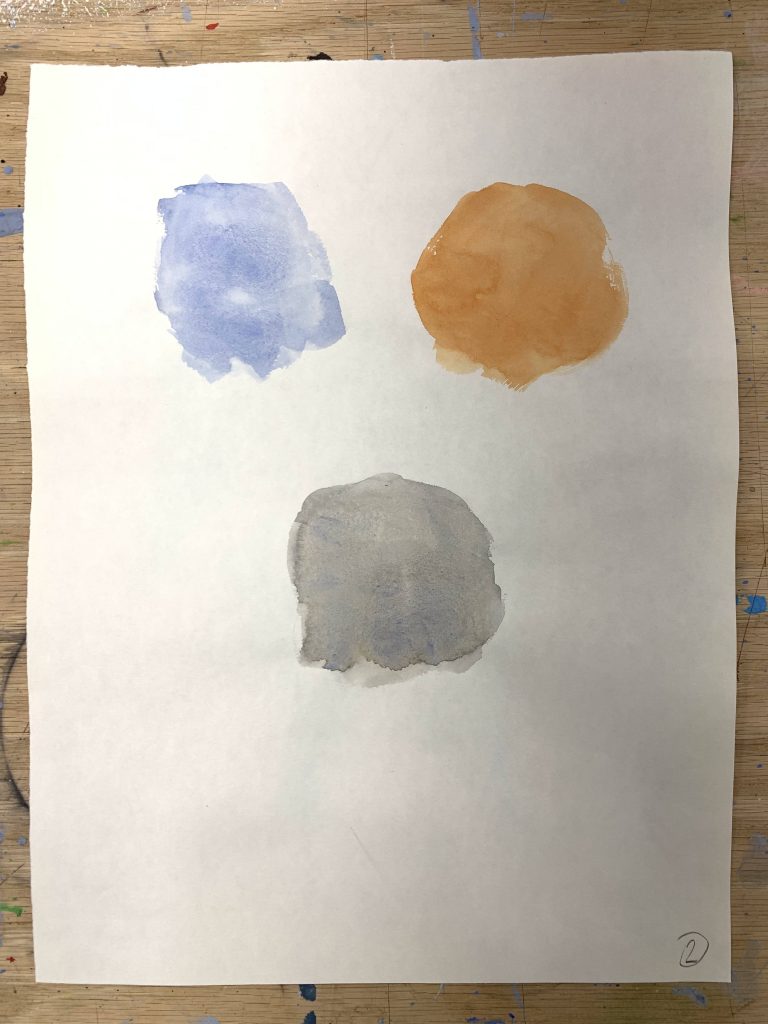
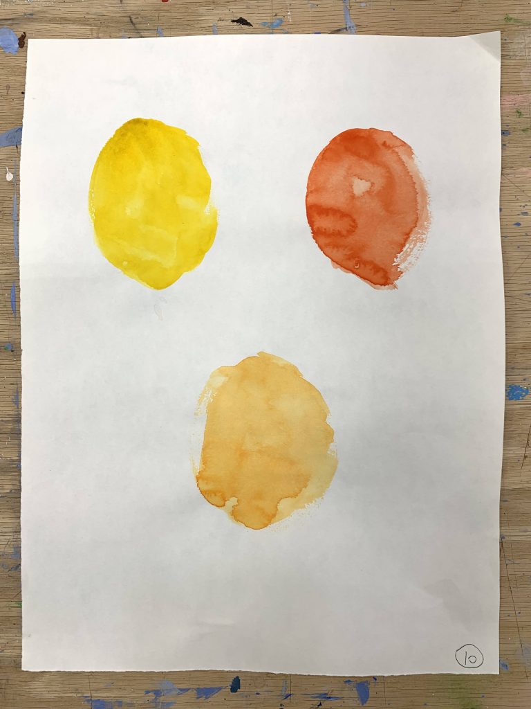
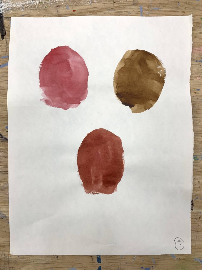
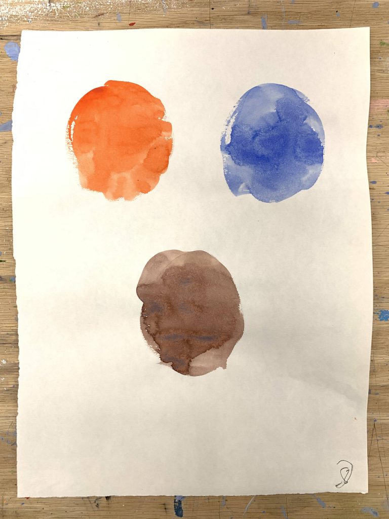
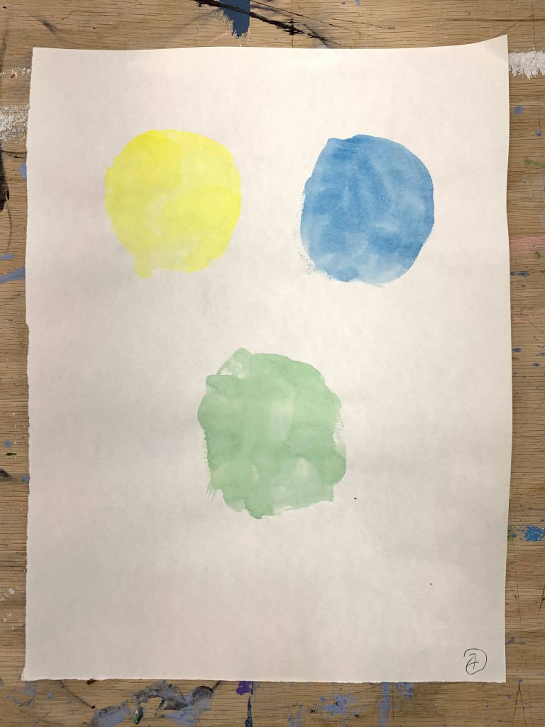
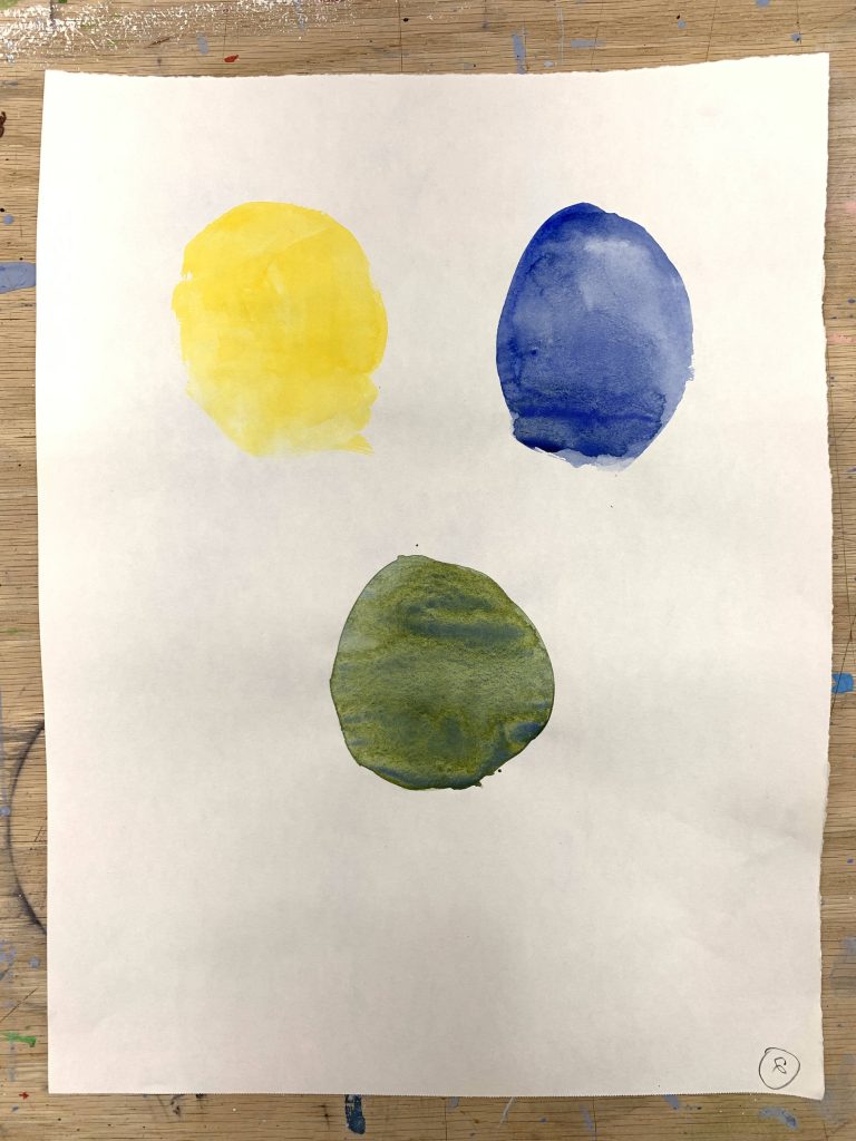
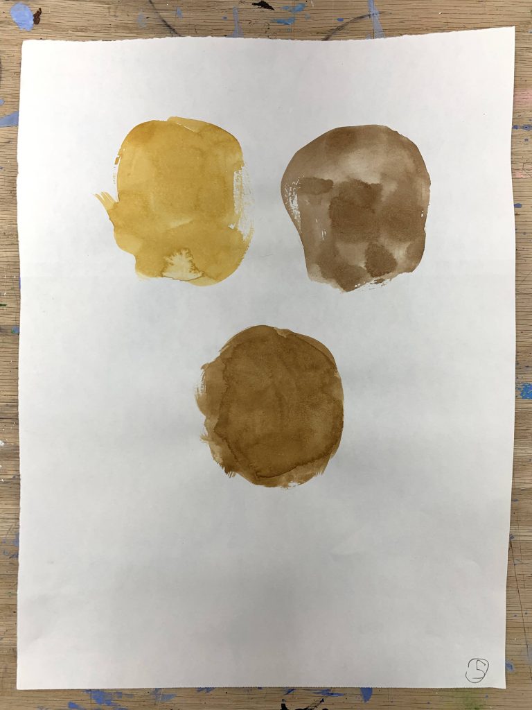
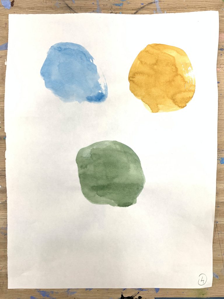
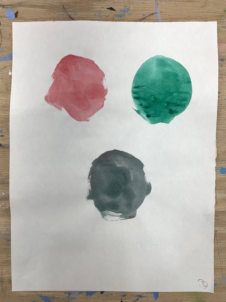
We did not jump straight into a finished piece. During the class, we pre-mixed colors first. We took two colors, mixed them together on the palette, and pulled them across the paper.
You can see an example of this process below.
We did this just to explore the idea of color. It helps relax the hand and quiet the thoughts about the watercolors themselves. When you are just pulling a swatch, there is no pressure to make it look like a tree or a sky. You get a little bit used to the medium. You feel how the water reacts with the paper.
This kind of exercise definitely helps you to understand not only color, but it helps you to understand painting itself. Painting is color. We have to learn to break that color down.
During these swatches, we quickly learned that we have to make sure to use the right proportions of two mixes to get the right result. If you put too much water, the mix falls apart. If you overload the brush with Alizarin Crimson, it completely destroys the Yellow Ochre. We were trying to make correct matches, and it became obvious that we have to always be careful about what proportions we use. This is something we must pay attention to every single time we touch the brush to the palette.
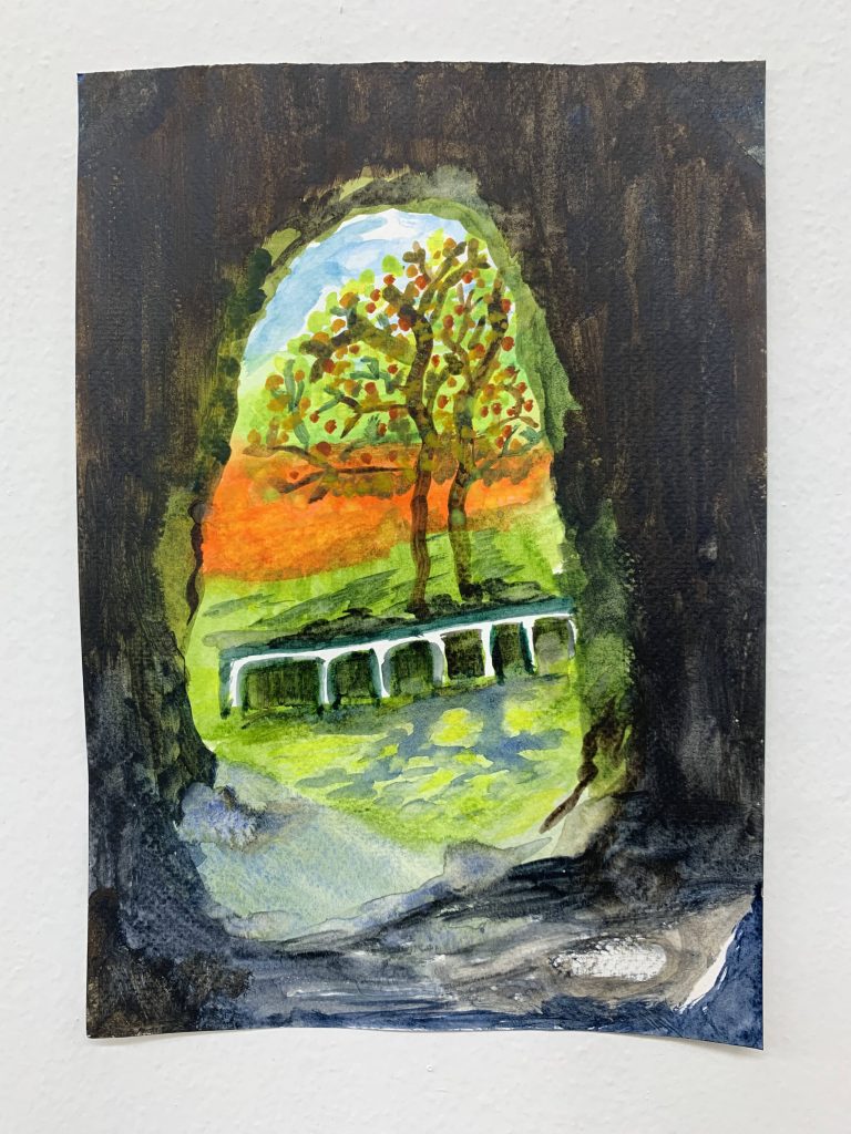
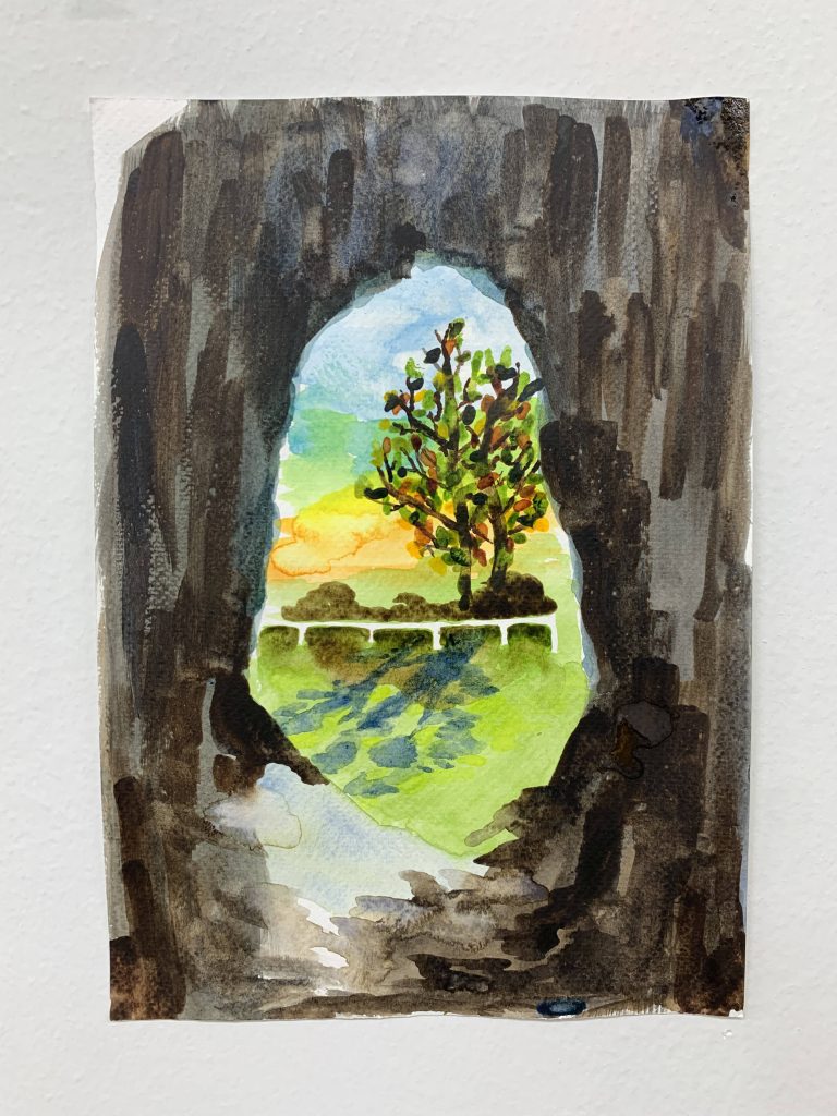
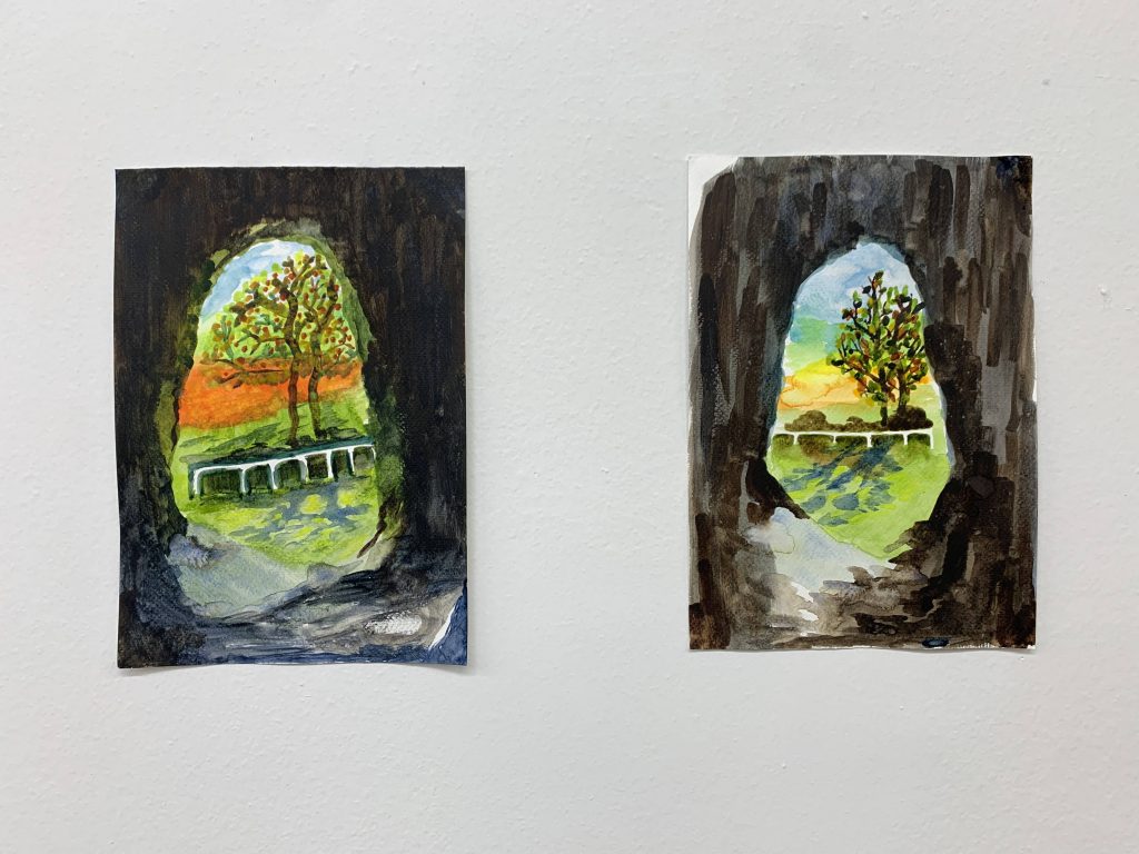
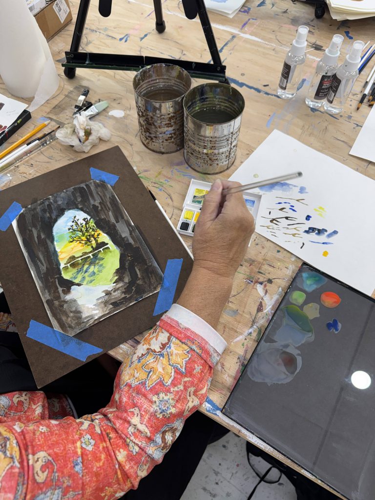
After we had our mixes dialed in, we moved toward a watercolor landscape. I did a live demo in front of the class, laying out the steps, and then the students followed based on their own experience levels to create their own paintings. You can try this yourself at home using the exact combinations we discovered.
The Master Mixing Guide
Here is the exact list of mixes we used and discussed to build our landscape. Use this as your reference guide. Try them on a scrap piece of watercolor paper until you can hit the exact hue every single time.
Core Two-Color Mixes
1. Ultramarine + Burnt Umber = Sepia (Warm Black) When you mix these two, you do not get mud. You get a deep, rich, warm black. During our landscape demo, we used this to anchor the darkest shadows under the trees. You have to watch your proportions. Too much blue, and it pulls cold. Too much umber, and it flattens out.
2. Ultramarine + Burnt Sienna = Payne’s Gray (Cool Black) This is your cool, atmospheric dark. It is perfect for deep shadows in the distance where the warm tones have faded away. It granulates beautifully on the paper, giving you immediate texture without extra effort.
3. Alizarin Crimson + Viridian = Perylene Maroon (Deep Neutral Black) Viridian straight from the pan is often too artificial for a natural landscape. By cutting it with Alizarin Crimson, you completely neutralize it, creating a deep, dark, near-black maroon that is incredible for deep structural shadows.
4. Cerulean Blue + Yellow Ochre = Terre Verte (Green Earth) This is a soft, muted, earthy green. We used this for the distant fields in the landscape demo. It recedes naturally into the background because it lacks the intense saturation of a Sap Green.
5. Yellow Ochre + Burnt Umber = Raw Umber If you need a cooler, darker earth tone than Yellow Ochre, this is the mix. It is excellent for blocking in the foundational structures of rocks or dead grass in the foreground.
6. Cadmium Yellow + Ultramarine = Hooker’s Green This yields a classic, deep mid-green. Because Ultramarine is a warm blue and Cadmium is a warm yellow, they mix to create a very natural, versatile foliage green.
7. Lemon Yellow + Cerulean Blue = Chartreuse This is a high-key, punchy spring green. It is aggressive. Use it sparingly for the areas of grass or leaves that are catching the absolute peak of the direct sunlight.
8. Cadmium Red Pale + Ultramarine = Dioxazine Violet (substitute) This creates a muted, brownish-purple. It is fantastic for the shadows inside clouds or the distant, hazy mountains where the air dulls the intense colors.
9. Alizarin Crimson + Burnt Umber = Caput Mortuum (Indian Red) This gives you a heavy, earthy, deep red. It is grounded and solid, perfect for brickwork, terracotta tiles, or deep, warm earth in the immediate foreground.
10. Cadmium Yellow + Cadmium Red Pale = Cadmium Orange A bright, intense, fiery orange. It is completely clean and transparent.
Core Three-Color Mixes for You to Try Yourself
Mixing three colors is where most people create mud. You have to be precise.
11. Ultramarine + Alizarin Crimson + Yellow Ochre = Indigo By adding the Yellow Ochre to a standard purple mix, you kill the high chroma and bring it down into a deep, moody, atmospheric dark blue.
12. Viridian + Alizarin Crimson + Burnt Sienna = Vandyke Brown This creates a massive, heavy, rich brown. The Viridian and Alizarin cancel each other out into a dark neutral, and the Burnt Sienna warms the entire puddle up.
13. Sap Green + Ultramarine + Burnt Umber = Perylene Green (Dark Forest Green) Sap green is often too bright on its own. Pulling it down with Ultramarine and Umber gives you the exact color of deep pine trees in the shade.
14. Cerulean Blue + Alizarin Crimson + Cadmium Yellow = Neutral Tint (Optical Gray) By combining the three primary hues from your palette, you create a perfectly balanced gray. This is essential for painting overcast skies or the shadows on white buildings.
15. Yellow Ochre + Cadmium Red Pale + Ultramarine = Venetian Red This is a soft, slightly dusty red-earth color. It feels like dry clay.
16. Viridian + Cadmium Yellow + Burnt Umber = Olive Green The Burnt Umber takes the artificial edge off the Viridian, while the Cadmium Yellow keeps the mix warm and alive. This is perfect for late summer foliage.
17. Sap Green + Burnt Sienna + Alizarin Crimson = Burnt Carmine A deep, bruised red-brown. It is heavy and sits firmly on the paper.
18. Lemon Yellow + Alizarin Crimson + Cerulean Blue = Warm Optical Gray Unlike the earlier neutral tint, this gray leans warm because of the specific pigments used. It is excellent for the warm shadows cast on a sunny day.
19. Ultramarine + Cadmium Yellow + Alizarin Crimson = Bistre (Warm Dark Brown) A transparent, warm, glowing dark brown.
20. Cerulean Blue + Burnt Sienna + Yellow Ochre = Raw Sienna This gives you a glowing, warm earth tone that is slightly more complex and textured than Yellow Ochre alone.
Habit is More Dependable Than Inspiration
During one of our recent sessions, a student from the acrylic class shared a story with the group. She told us that she wakes up every morning roughly around 5:00 AM. The house is completely quiet. While she is drinking her coffee, she spends about 20 to 30 minutes painting. She also watches online tutorials during this time, and that is how she improves, little by little, every single day.
I want to encourage all of you to do exactly the same, if you can.
It does not have to be at 5:00 in the morning. It could be right before you go to bed instead of reading a book or watching TV. Carving out that small window of time is not only a relaxing exercise, but it is the exact time where you build your skill.
At the beginning, when we start painting, quantity is more important than quality. You cannot sit down and expect to paint a masterpiece on your first try. We have to go through loads of paper in order to finally get what we want from the painting. Deadlines and daily habits are creative accelerators. They prevent the pursuit of perfect and force you to make decisions on the paper.
Closing the Gap
Let me give you my own example.
When I was in high school, I knew I wanted to be an artist. My imagination was constantly working. I was imagining paintings in my head that I was still completely unable to paint on the canvas. There was a massive gap between my taste and my ability. It was entirely because my hand was not skilled enough yet to execute whatever I wanted to do.
It took me time to get to that point. I was only able to close that gap by practicing every day. When I was at school, and immediately after school, I made sure that I spent an additional 3 to 5 hours drawing or painting just to improve my specific skills in visual arts. I went through reams of paper. I mixed thousands of muddy colors before I learned how to control the palette.
For you, finding 20 minutes a day may seem like a lot. You have so many other things you have to take care of your work, your household, and all your other responsibilities. But small, steady gains compounded over time will drastically change how you handle a brush. If you pull out that 12-color palette for just 20 minutes a night and practice mixing the combinations listed above, your hand will learn the proportions. Your eye will learn to read the temperature.
Stop waiting for inspiration. Just put the brush on the paper.
If you are ready to stop guessing and start building real structural control over your work, enrollment for our next session is open. We limit the groups strictly to six people so I can look at exactly what you are doing on the easel and correct it in real-time.
Acrylic Course on Tuesdays
🗓️ Tuesdays, 6:00 PM – 9:00 PM
👥 Limited strictly to 6 seats per group
🎒 All professional materials included
💵 Tuition: $300
Reserve your spot here: https://artbeyou.com/acrylic-painting-course
Watercolor Course on Thursdays
🗓️ Thursdays, 6:00 PM – 9:00 PM
👥 Limited strictly to 6 seats per group
🎒 All professional materials included
💵 Tuition: $300
Reserve your spot here: https://artbeyou.com/watercolor-painting-course